Ayong Son is an artist and designer who works across various media and forms. She works between Europe and Asia, and is currently staying in Berlin. For commissions, contact her at mail@sonayong.com. Her Instagram is @sonayong. She uploads videos on YouTube about things she observes in her life.
Ayong Son continues a practice exploring color and form. This section presents works that most clearly reflect a personal visual language through studies and experiments.
Yellowish Red Fruits
,
2022
Art
Ayong Son has worked with various clients and collaborators, developing designs shaped by each project’s purpose and context. This section highlights projects with clear commercial or collaborative intentions.
26th jeonju international film festival
,
Festival Identity design
,
2025
The poster for the 26th Jeonju International Film Festival captures the essence of film through the themes of “frames” and “connections,” while visually expressing the continuity and flow of the festival from the 24th and 25th editions to the present. Drawing inspiration from the circular holes of a film projector, the design incorporates 26 circles to represent the movement created by a sequence of static images. The harmonious blend of diverse colors reflects the festival’s diversity and inclusivity, while the curved arrangement of elements emphasizes its continuity and organic connections.
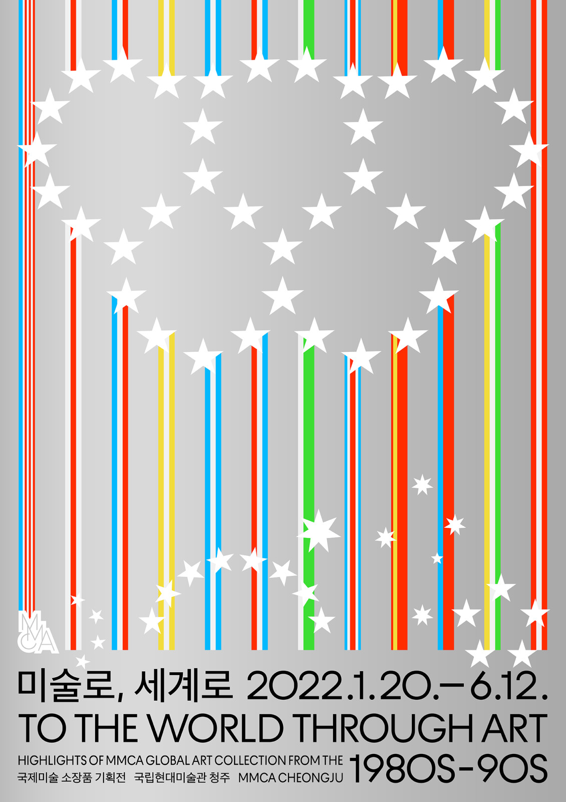
The exhibition 《To the world through art 1980s – 90s》 showed exotic art from the 1980s to 1990s in South Korea and it made public the works from the 1988 Olympics that influenced the international exchange of Korean art. The poster had to show that it is an exhibition of exotic works, and express every country equally, so I used colours from various national flags and symbols. But there was a tacit rule that certain countries should not stand out, so the colours and symbolic elements of the flags were separated. I used the colours and patterns without symbols from the flags. I utilised the stars from the flags to evoke the Olympic symbol of the ‘88 Olympics, the origin of the collection.
Happiness Sans promotion video
,
Promotion video
,
2022
Happiness Sans is Hyundai Department Store’s exclusive typeface, developed to embody the brand mission: "Make customers happy, enrich the world." This promotional video introduces the background and philosophy behind Happiness Sans, visually expressing moments of happiness found in everyday life. It naturally showcases the design features and versatility of the typeface, while also conveying the values and direction that Hyundai Department Store pursues.
Project Production: Hyundai Department Store Group
Project Direction: Hyundai Department Store Group (Eerang Park)
Art Direction: Hyundai Department Store Group (Hyunsong Lee)
Project Management: Hyundai Department Store Group (Hyeoni Lee, Hyunsong Lee, Moonjung Cha)
Website Design: Hyundai Department Store Group (Hyunsong Lee, Moonjung Cha)
AG Typography Institute Planing and Directing: AG Typography Institute (Moa Ku)
Type Design: AG Typography Institute (Moa Ku, Jookyeong Kim, Seunghwan Kim)
Type Production: AG Typography Institute
Motion Planing and Design: 1-2-3-4-5 (Ayong Son, Jisu Lee)
Web Production and develpment: 1-2-3-4-5 (Dayoung Jung, Gunhyuk Choi)
Motion Sounds: Millic
Lobby
,
logo
,
2022
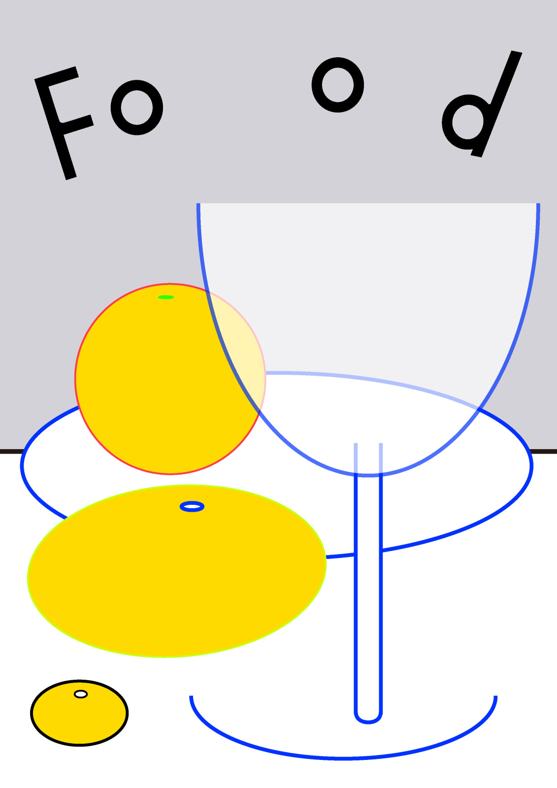
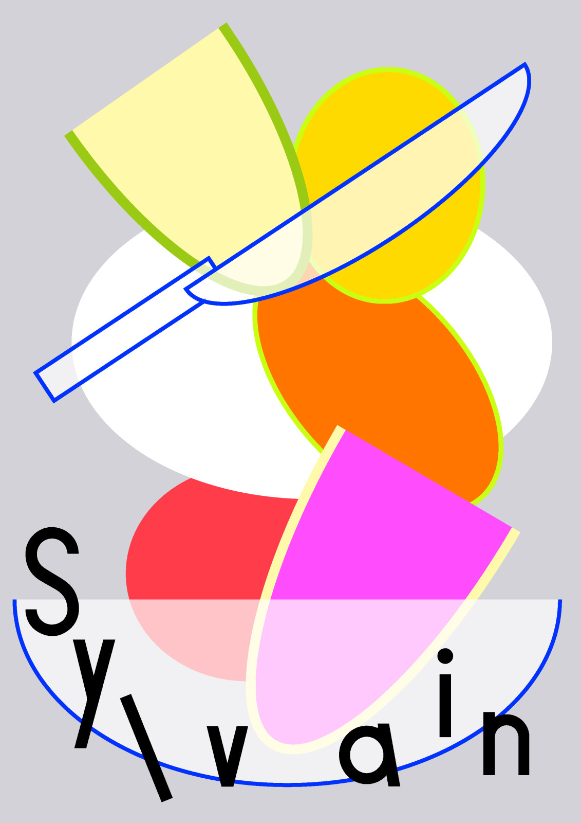
Food/Sylvain poster series
,
Poster
,
600×900mm
,
2022
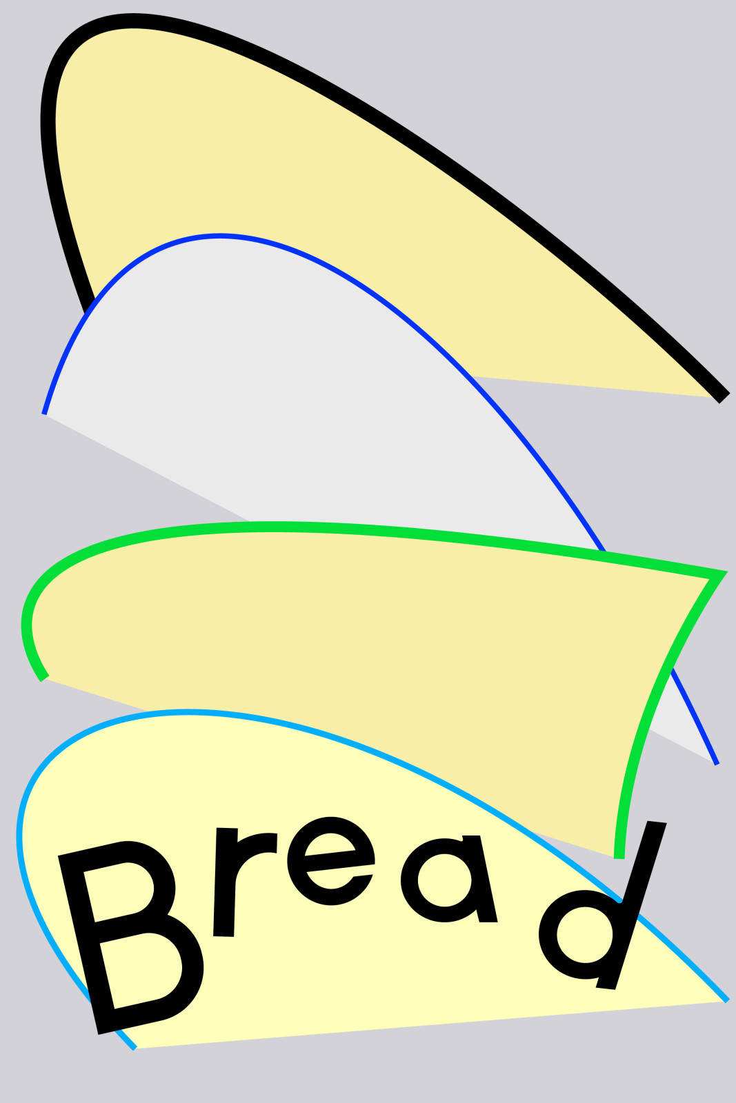
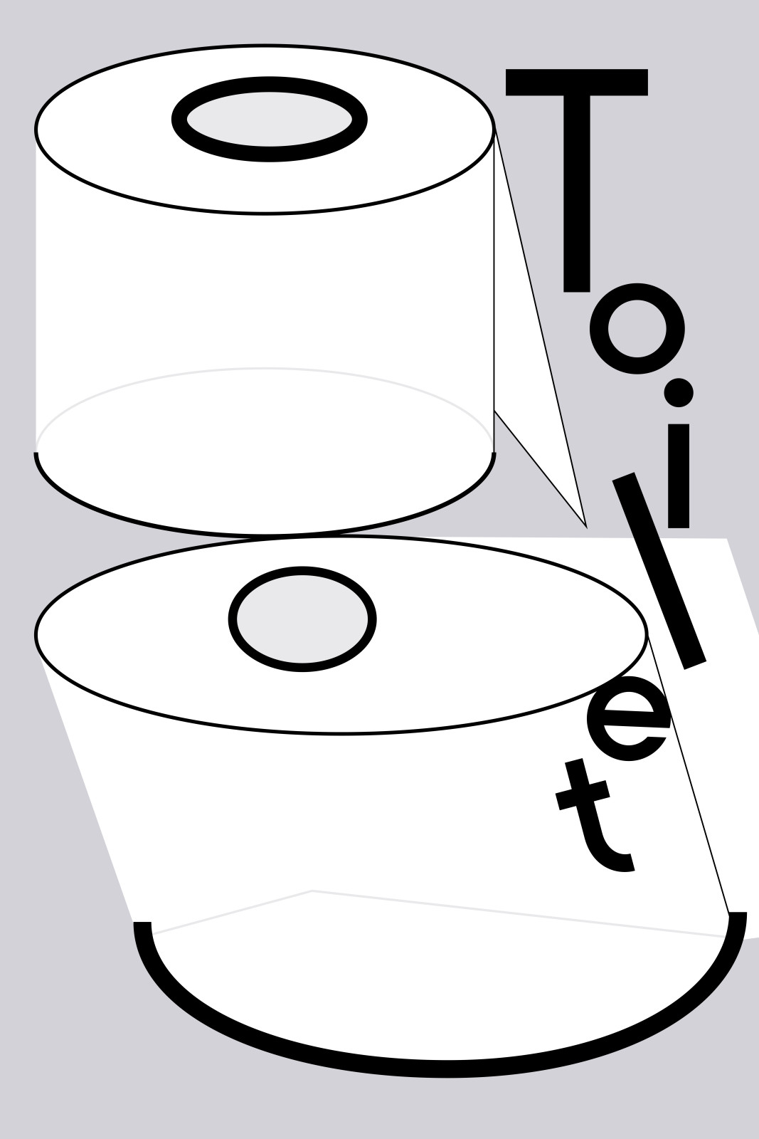
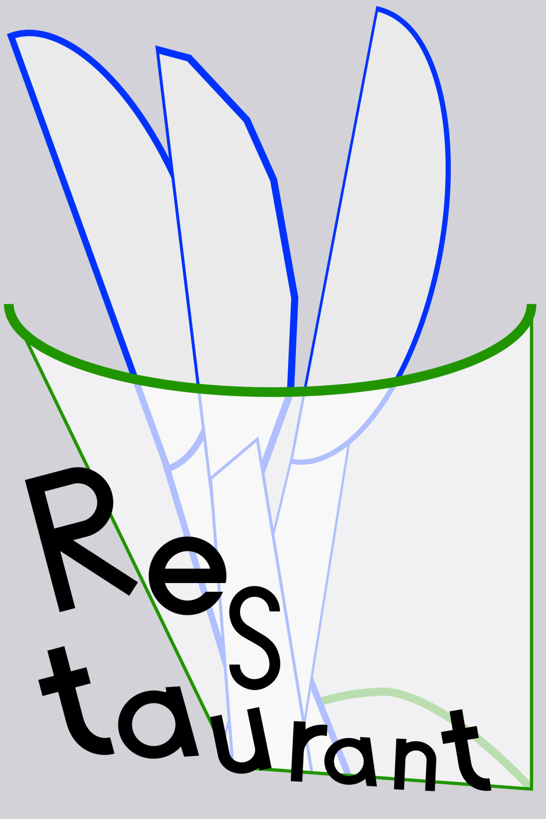
This is a poster series made for the French restaurant Food Sylvain. It represents words and images related to restaurant and dining. The 《Toilet》 poster tried to express the toilet neutrally because it is a public toilet, and the 《Bread》 poster was created to show the restaurant’s self-service bread counter. The 《Restaurant》 poster was designed to make the location of the restaurant known to you.
Typeface design: Dayoung Jung
Food/Sylvain poster series
,
Poster
,
841×1261mm
,
2021
Typeface design: Dayoung Jung
Food/Sylvain poster series
,
Poster
,
594×841mm
,
2021
Typeface design: Dayoung Jeong
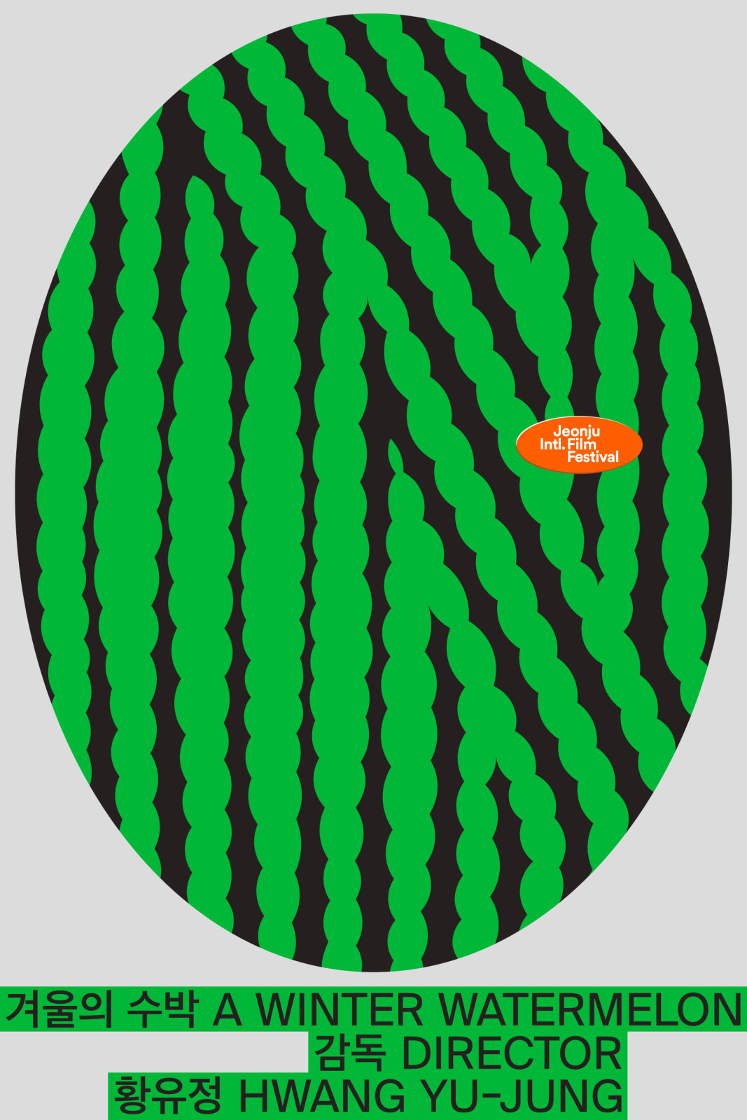
A Winter Watermelon
,
Poster
,
600×900mm
,
2019
This poster represents the film 《A Winter Watermelon》 in which the director is Hwang Yu-jung. It was made for the event 100 Films 100 Posters of the Jeonju International Film Festival. In this event, 100 graphic designers designed 100 film posters. The posters in the event are aimed at excluding commercial pressure and convention of film posters to freely represent the heart of the film by graphic designers.
The film 《A Winter Watermelon》 tells a gap between the ideal and reality of the main character through ‘a watermelon’. The reason that I drew a big watermelon on the poster is that I thought the important factors in the most scenes appear metaphorically or directly through a watermelon. Twisting and deforming the watermelon pattern represent the conflicting feelings and a gap between the ideal and reality of the main character. The background in the film is win ter, which means re al ity. I rep re sented it by us ing a cool grey colour instead of us ing a warm colour with soft snow. As well, the fes ti val logo is labelled such as a fruit sticker, matching with the other visual elements.
Goods is good
,
Poster
,
2019
Goods is Good was an event held from February 23 to August 25, 2019, at D Project Space. It brought together and showcased a variety of illustrators’ works and goods in one place for exhibition and sale. The poster was designed based on the event’s name, “Goods is Good,” focusing on keywords such as “cart,” “shopping bag,” and “shopping” to intuitively convey the concept. The overall color scheme and mood were set to highlight vibrant primary colors against a dark background, reflecting the actual event space, which was decorated with colorful electronic displays under dim lighting.
Sound: Dahyun Park
Plus global audition
,
Motion graphic
,
2019
Sound: Dahyun Park
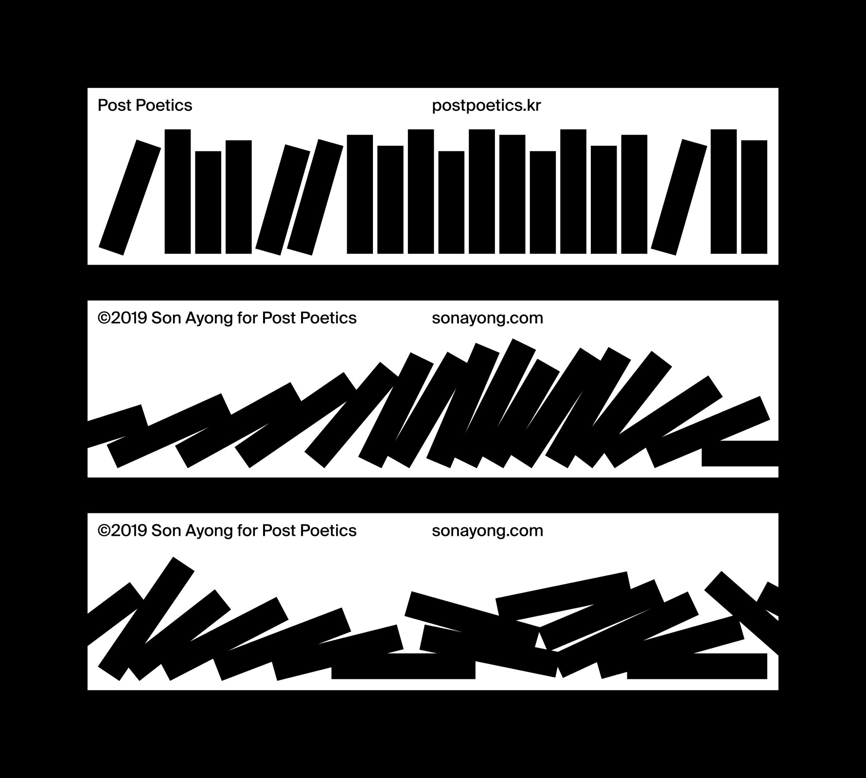
Bookmarks for Post Poetics
,
Bookmark
,
2019
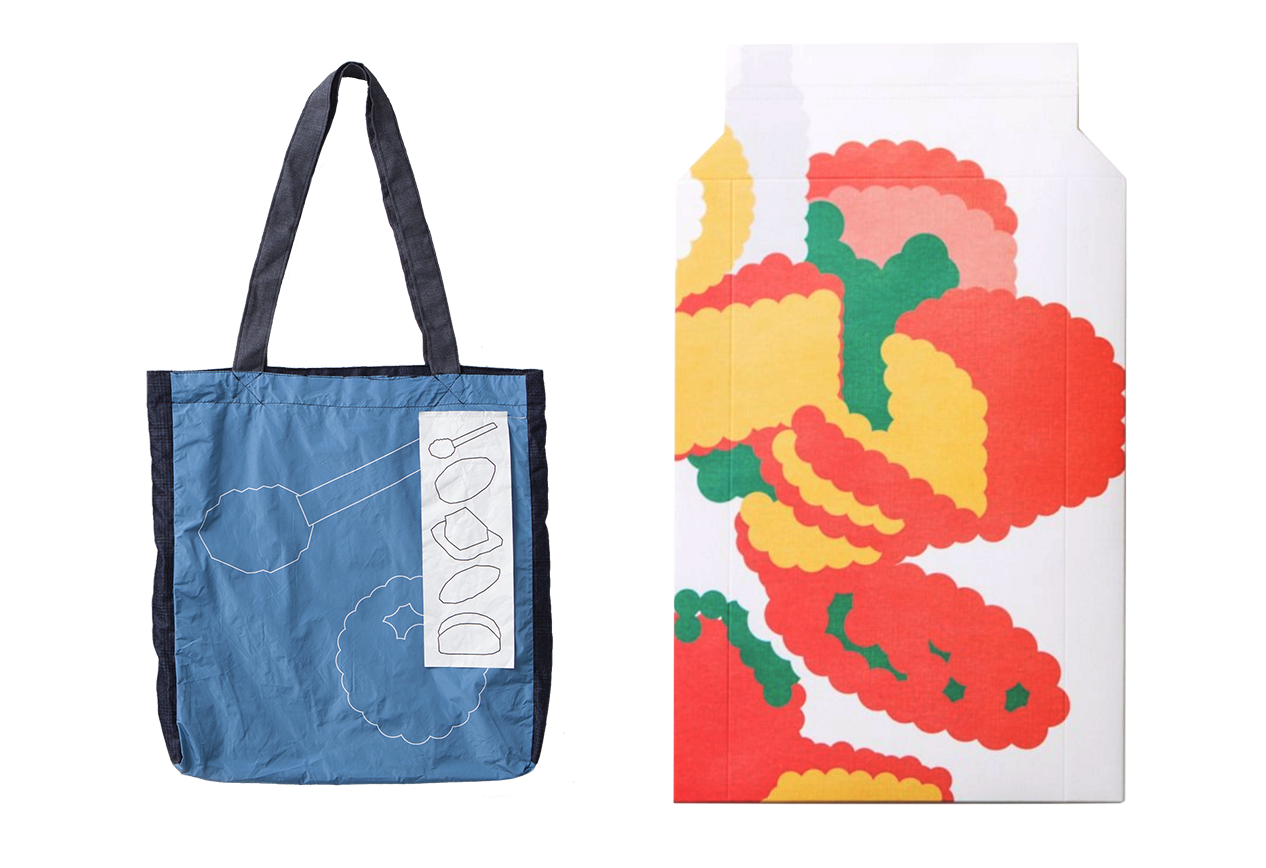
Venice Biennale Korean Pavilion Ecobag Package
,
Ecobag & Package
,
2019
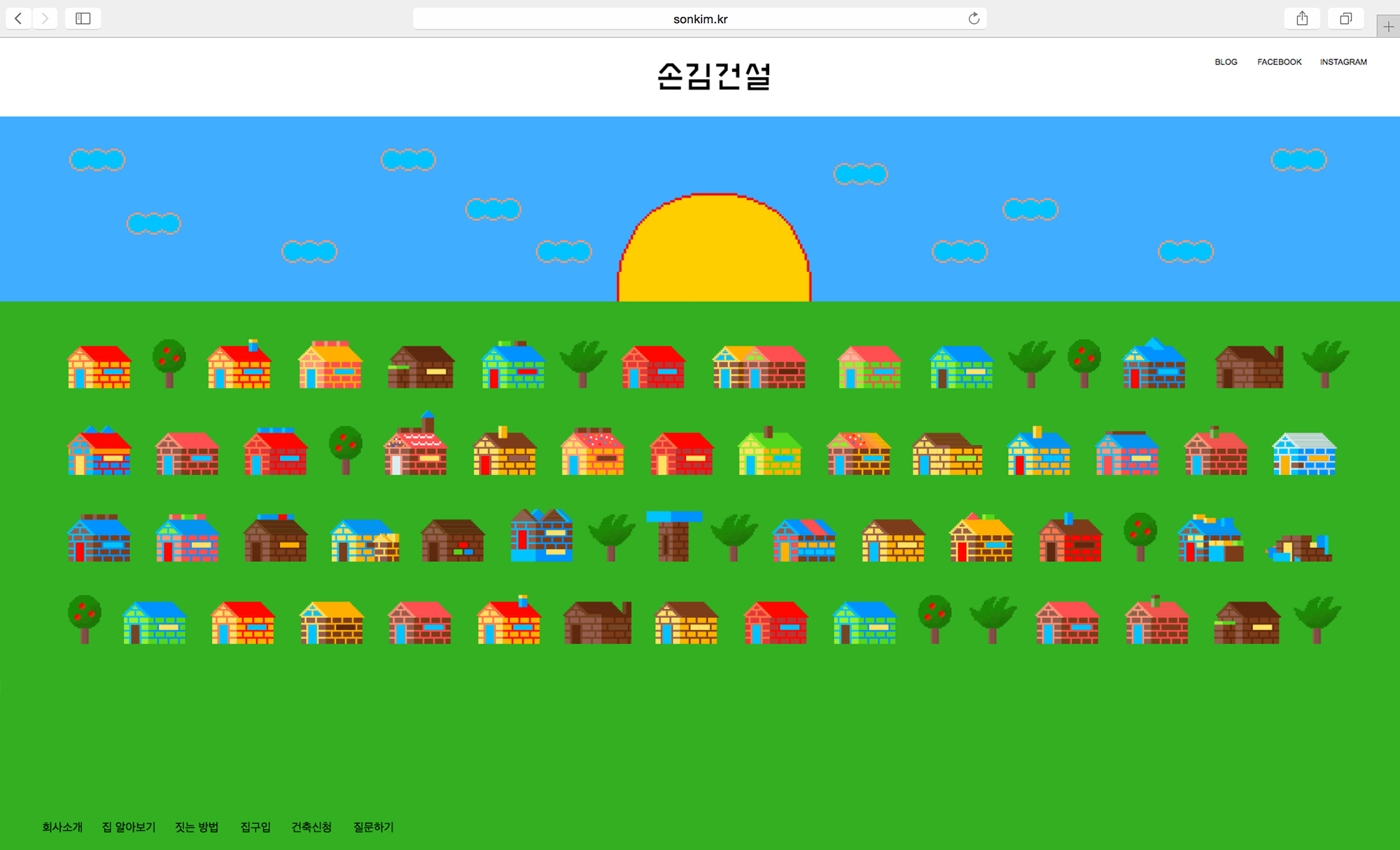
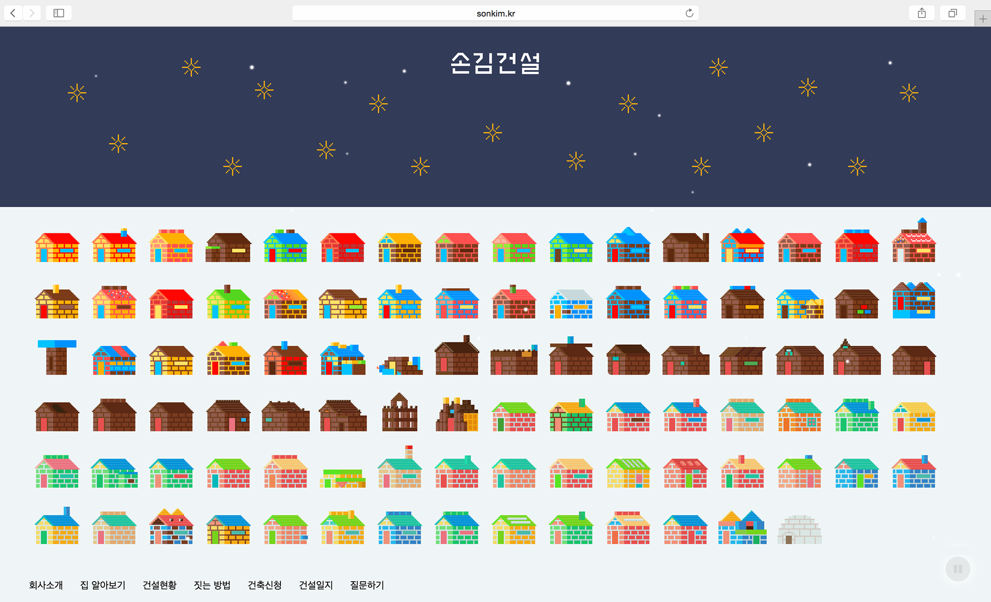
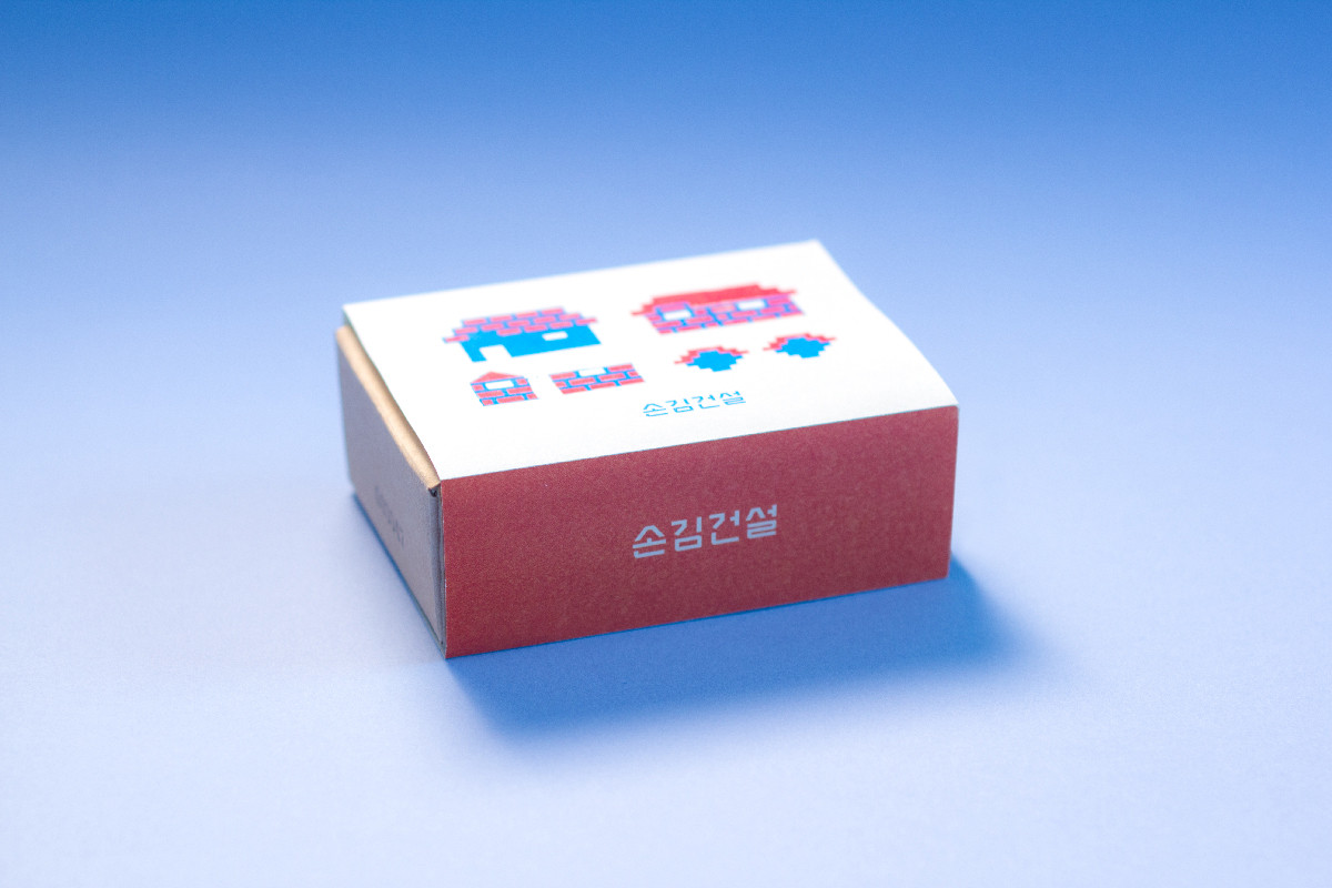
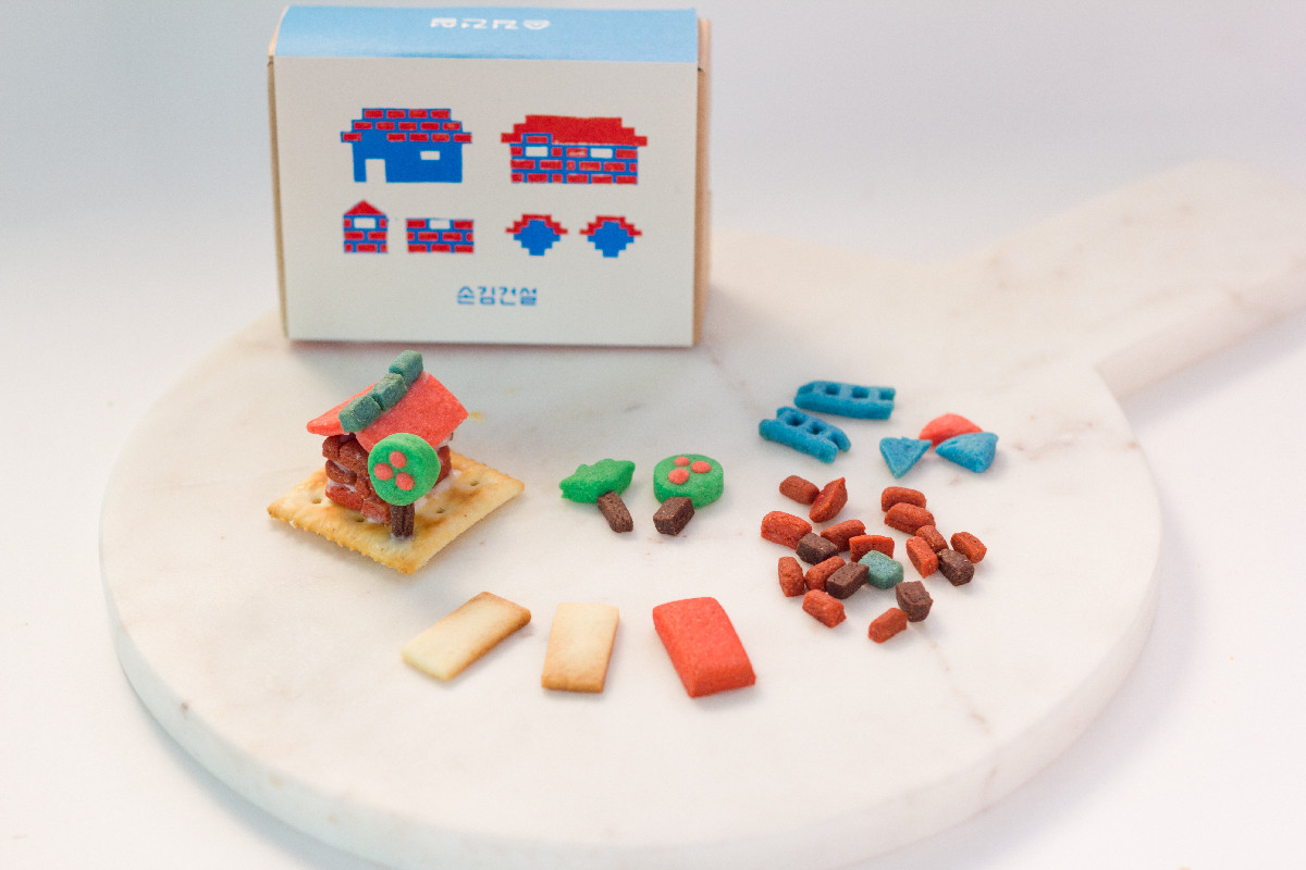
SonKim Construction
,
Website
A platform was created for customers to upload and share photos of the cookie houses they built. The house-shaped icons on the website are modeled after the actual cookie houses made by customers, and clicking an icon reveals the builder.
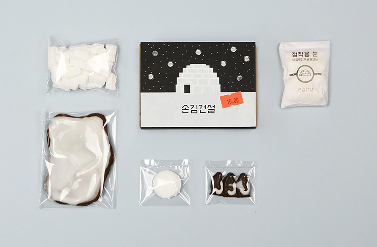
SonKim Construction
,
2017
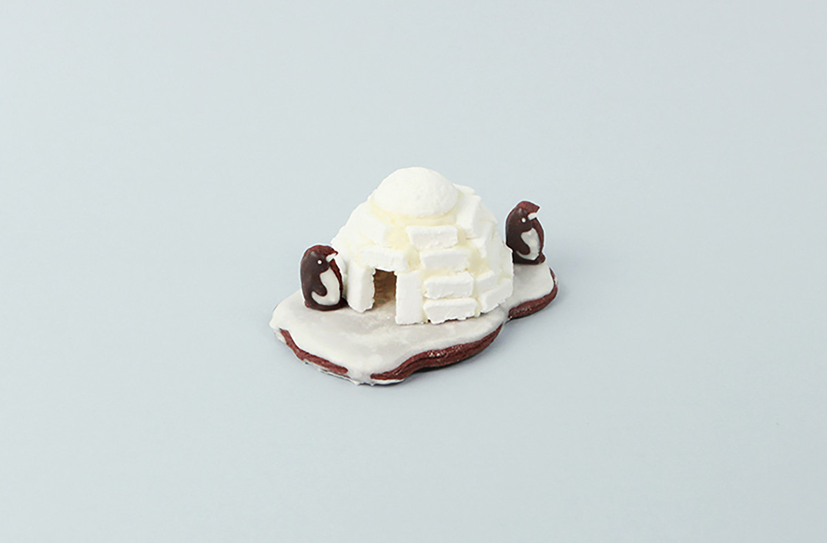
SonKim Construction has launched a new version of its cookie house kit, the Igloo Kit. Using marshmallow snow and a marshmallow roof, users can build their own small igloo.
SonKim Construction
,
2016
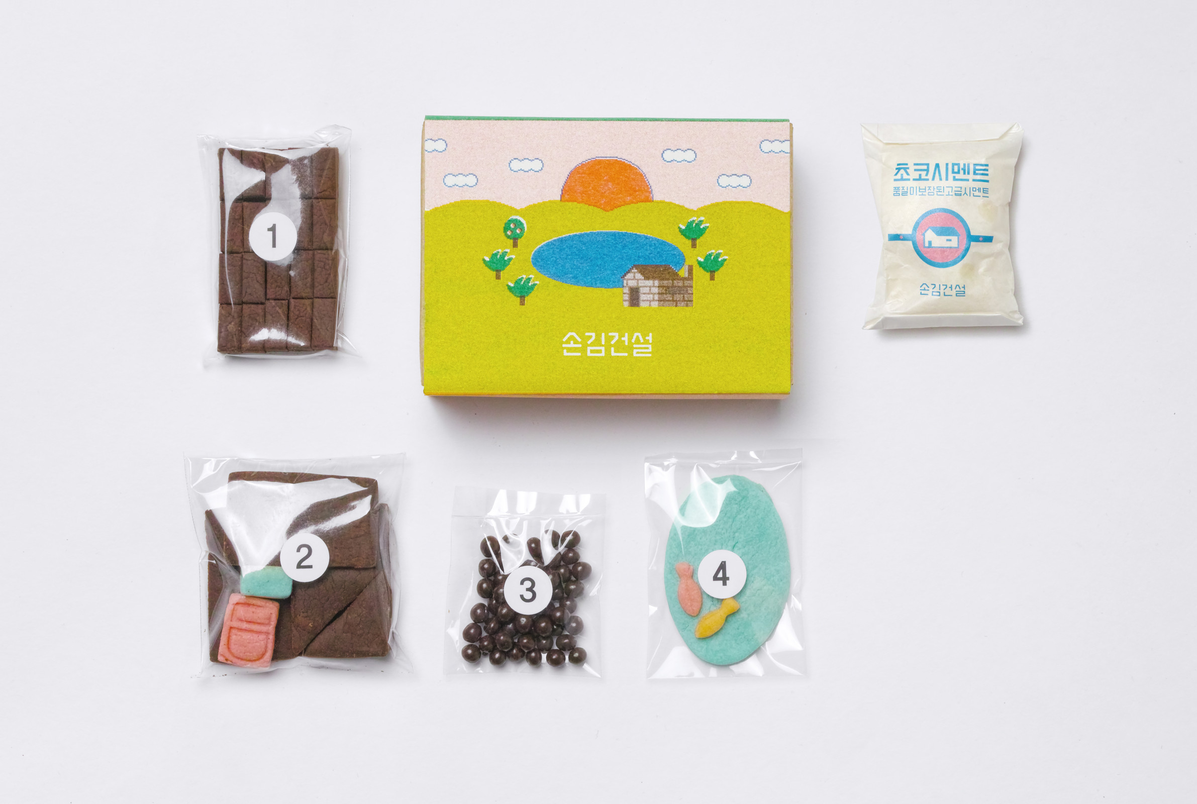
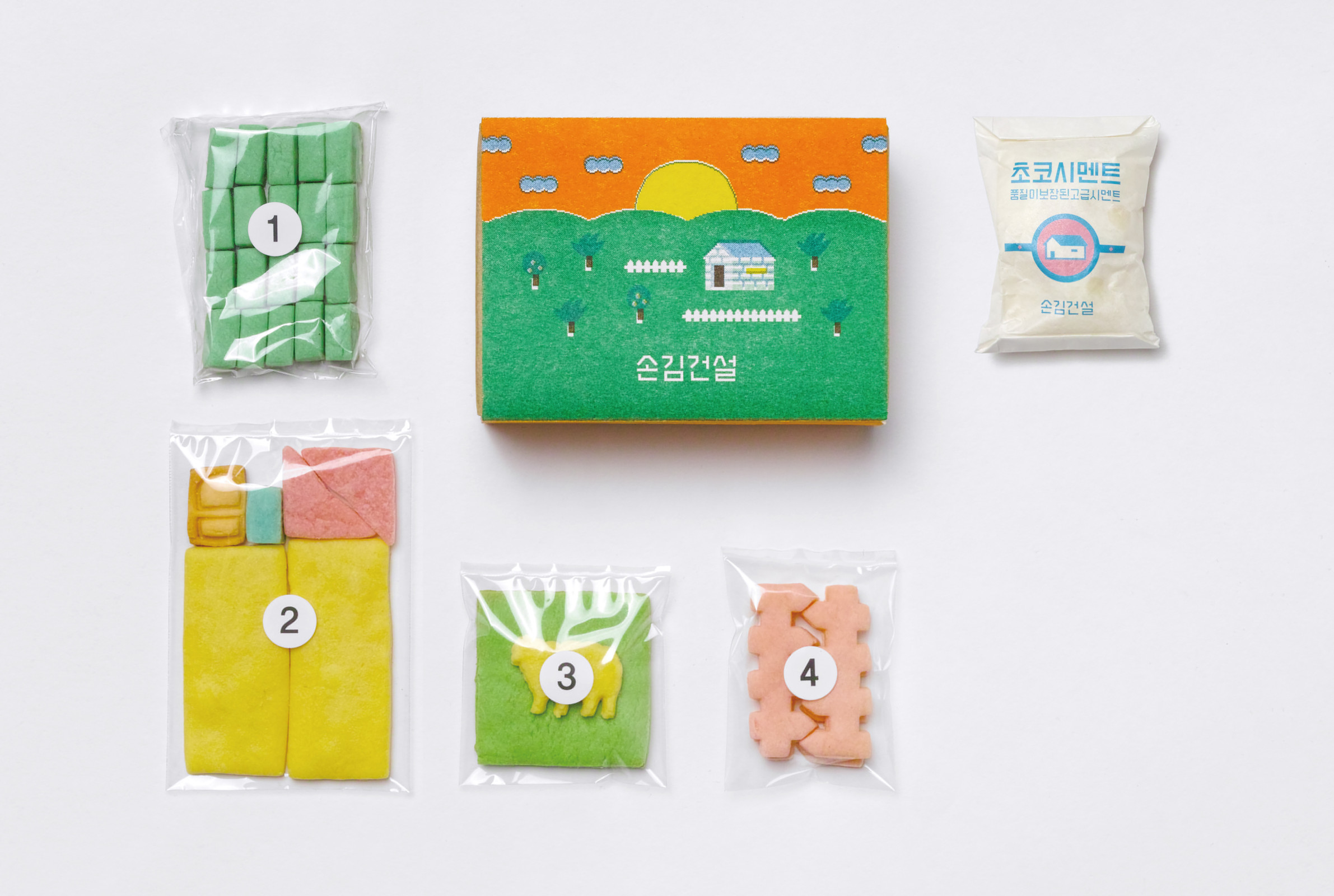
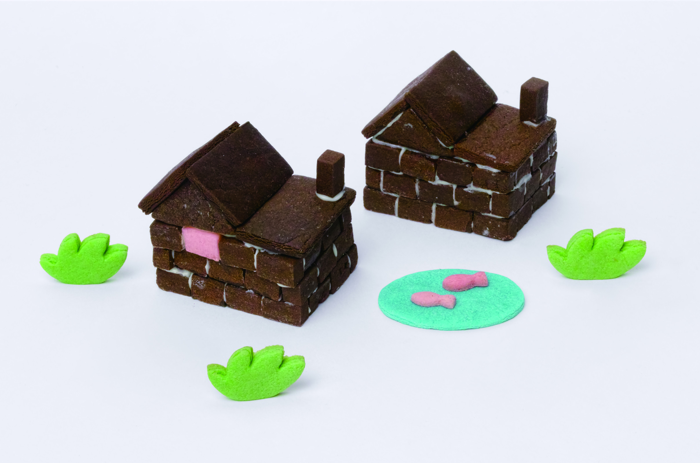
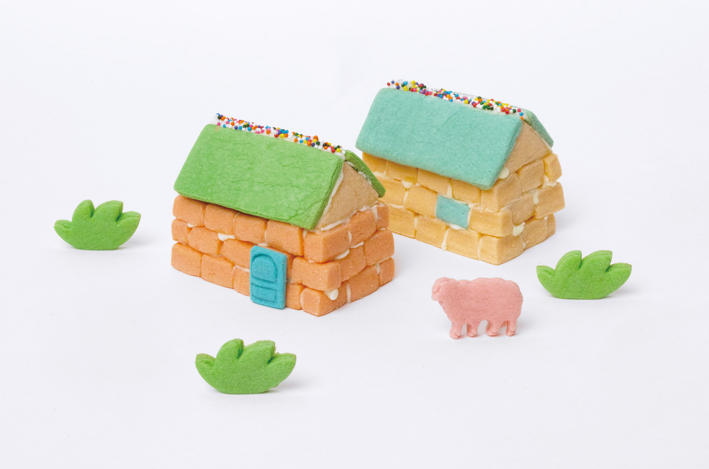
Sonkim Construction has released new versions of its original house kit: the Mountain Lodge Kit (chocolate flavor) and the Ranch Kit (butter flavor). The Mountain Lodge Kit adds a pond to the basic house structure, allowing users to raise fish, while the Ranch Kit includes a ranch where sheep can be raised. Each kit expands on the original base model by offering various new features, providing a richer and more engaging house-building experience. Alongside the new releases, improvements have been made to enhance the overall product quality. The size of the cookie bricks and parts has been increased by 1.5 times compared to the previous version, and their thickness has been standardized for smoother edges. A door has been added to the basic house structure for a fuller appearance, and the amount of chocolate cement has been increased to improve assembly stability. The instruction manual has also been revised to guide users through the building process more easily and clearly.
SonKim Construction
,
2015
SonKim Construction was a cookie house building company founded by Ayong Son and Jiyoon Kim, active from 2015 to 2017.
They created edible houses using cookie bricks and chocolate cement, combining craftsmanship with playfulness.
Each season, a new concept was introduced, and DIY kits were offered for customers to build their own cookie houses.
Design
Ayong Son founded the studio 1-2-3-4-5 in 2018 and worked collaboratively with various people to design and develop web spaces until 2023. This section archives projects created at 1-2-3-4-5, while new projects continue occasionally as needed. 1-2-3-4-5.studio
1-2-3-4-5.studio
Web
Ayong Son is currently developing her own brand, extending her graphic practice into objects. This section introduces pieces that translate her visual language into tangible forms.
under construction
under construction
under construction
under construction
Shop
본 웹사이트는 Internet Explorer 환경에서 정상적으로 작동하지 않습니다. Edge, Chrome, Safari 등의 다른 브라우저를 이용해 주세요.